Maven Family Leave Challenge
Link to GitHub repository, including data and final output.
1. Project Title
Family Leave policy review of more than 1600 organisations.
2. Problem
I am working as a Data Visualization Specialist at an online business journal for this challenge. I create charts, visuals, and infographics as supporting content for articles.
3. Data
This dataset contains 1 table in CSV format: Crowdsourced parental leave data from 1,601 companies across different industries, including paid/unpaid maternity and paternity leave weeks.
Data cleaning and transformation:
4. Results
Forethought:
The challenge asks for a set of visualisations. Hence, I focus on creating complete visualisations without further filtering and interaction needed.
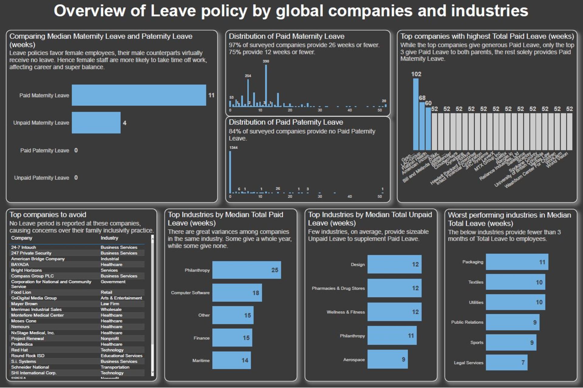
The first chart looks at comparing Paid/Unpaid Maternity/Paternity leaves. On an average level, female staff have about three months of paid leave and another month of unpaid leave. However, male staff essentially receive no leave at all. I use Median numbers because, looking at the next two charts on the distribution of leave periods, the data is highly positively skewed.

The visualisations were created in Power BI. The data was cleaned and transformed in the Power Query Editor.
6. Challenges
At first, I did have some challenges creating the bar charts because the legends and categories did not behave like my initial thought. After some digging, I discovered that unpivoting all the leave columns helped. This put the Leave categories into one column, making it easier to modify the charts.